Ballenato Bar & Restaurant
Brand Identity
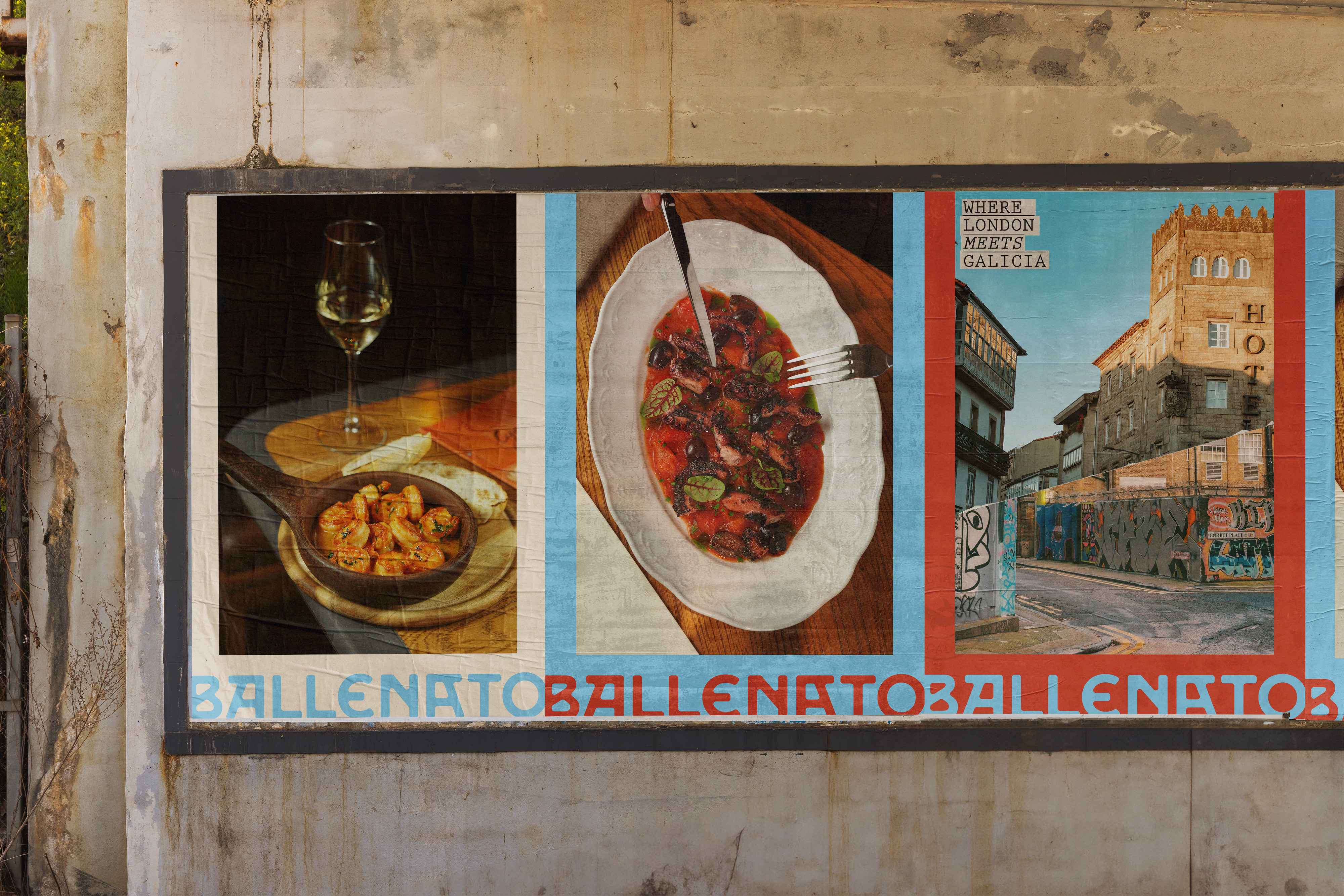
Founded by brothers Xosé & Anxo Mariño, Ballenato brings Galician dining to the East End of London.
Ballenato (pronounced ‘Bye-e-nah-toe’) meaning “little whale” in Galician, is a casual restaurant and bar, where patrons can relax and soak up the atmosphere, serving local specialities from their home region of Galicia, Spain.
The name references Galicia’s strong maritime history and is named after the pub in the brothers’ home town of Viveiro that inspired their lifelong love for local cuisine.

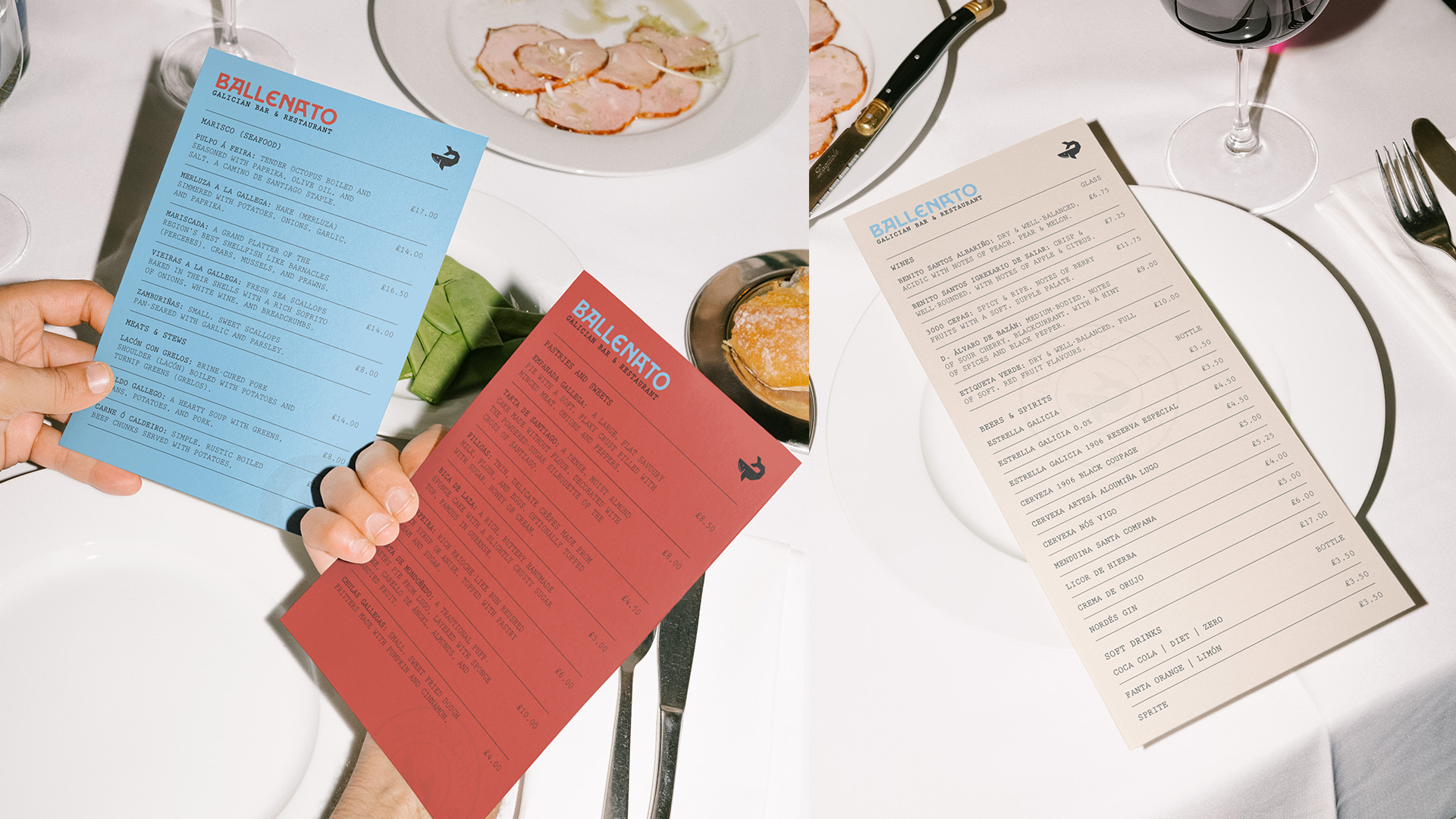
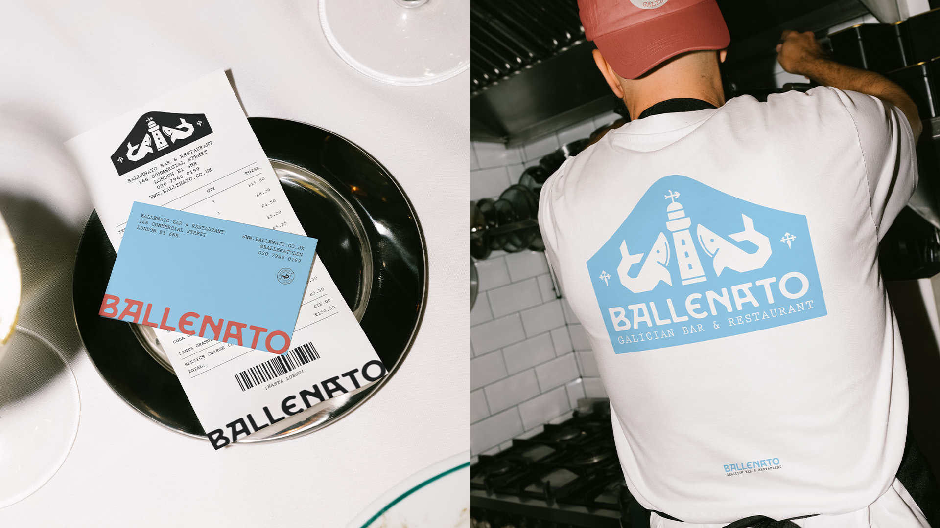
It was very important that the branding was steeped in Galician identity, with colours pulled from the region's flag paired with illustrations of regional and cultural symbols, both contemporary and historical.
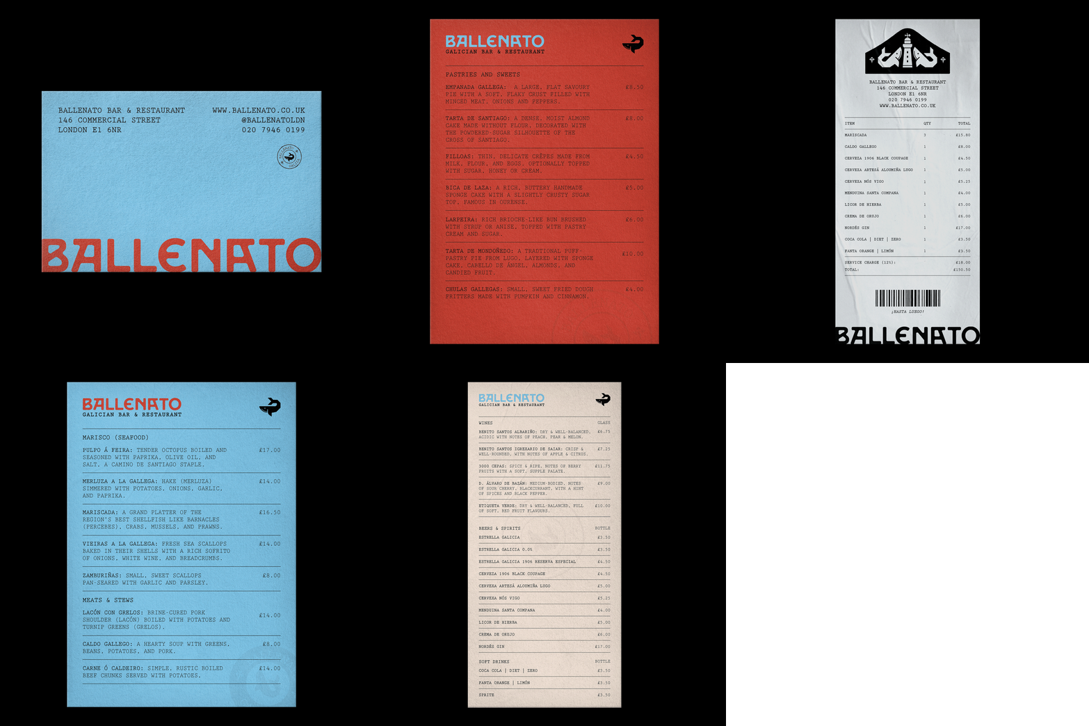
The identity is structured around a paired-back, raw typographic style, using just a singular monospaced font throughout. It uses simple, utilitarian layouts brought to life through a vivid, high-contrast colour palette.
The identity is structured around a paired-back, raw typographic style, using just a singular monospaced font throughout. It uses simple, utilitarian layouts brought to life through a vivid, high-contrast colour palette.
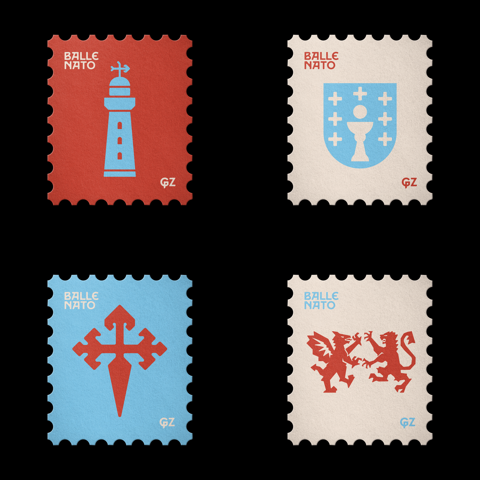

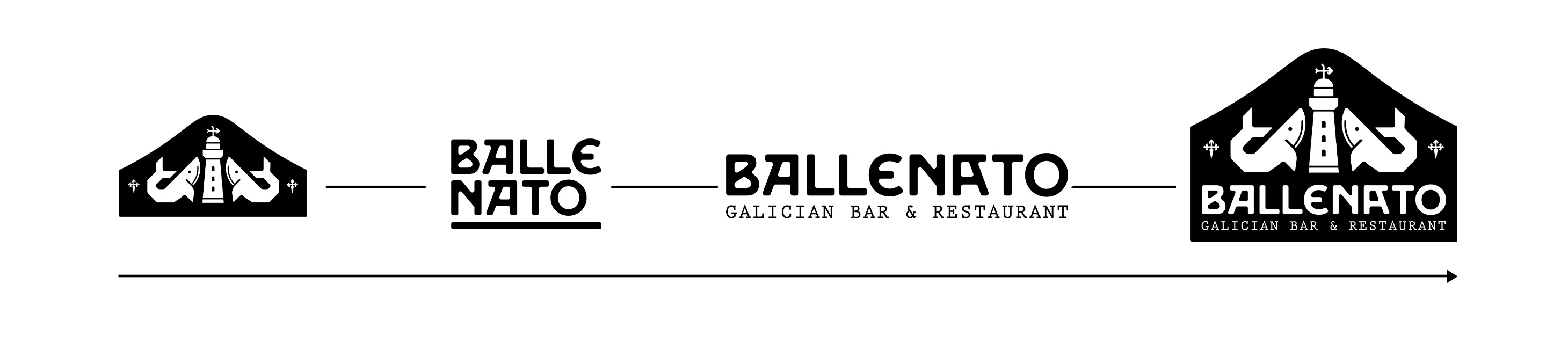
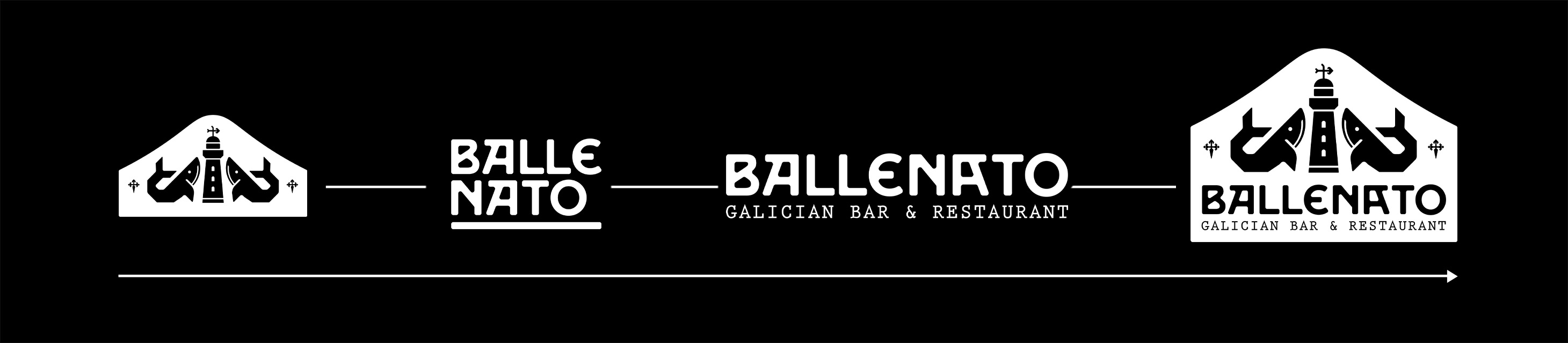
The logo system spans four primary designs. A ‘badge’, a small decorative mark used for ornamentation. A condensed wordmark, for use in tight spaces. The wordmark, the primary logo, and the ‘plaque’/full logo, a large decorative mark used sparingly throughout the design for added visual flair.
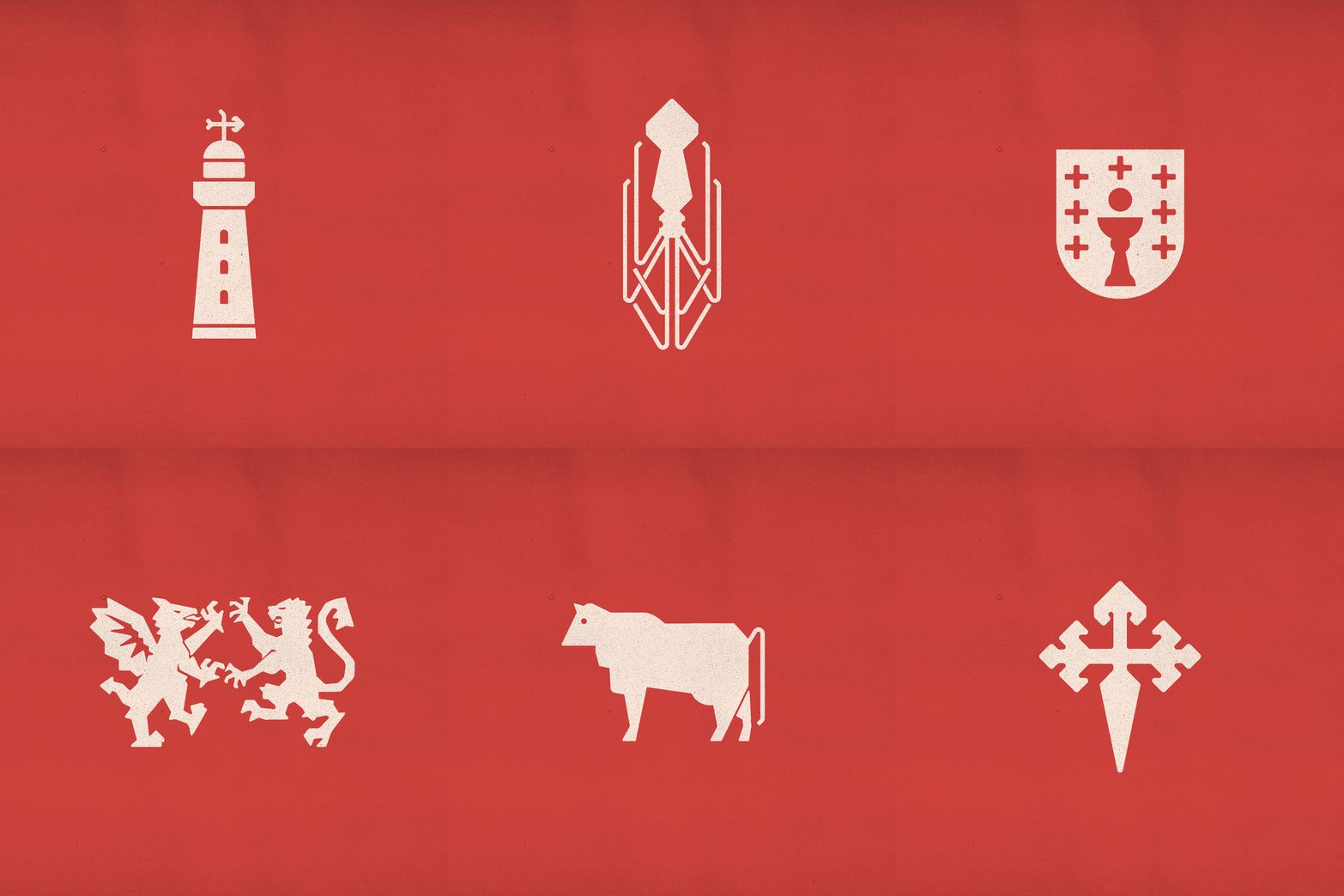
The identity comes packaged with a suite of illustrations/icons representative of Galicia, its landscape, gastronomy, culture and traditions.
These include, but are not limited to; a lighthouse, local livestock, the cross of Santiago, the Escudo de Galicia, and the Gallaecia royal standard.
The colour scheme pulls from the flag of Galicia which is primarily blue and white, it's evocative of the sea and the region’s strong maritime links. With red being a colour heavily associated with the Galician independence movement.
These include, but are not limited to; a lighthouse, local livestock, the cross of Santiago, the Escudo de Galicia, and the Gallaecia royal standard.
The colour scheme pulls from the flag of Galicia which is primarily blue and white, it's evocative of the sea and the region’s strong maritime links. With red being a colour heavily associated with the Galician independence movement.